Tubular React
By Ana Atayde - 05 Aug 2019
Tubular-React
Tubular-React is a client-side set of ReactJS components that we can use to design and build modern web applications.
All the components work on the Grid Request Definition which communicates with the server sending the desired data transformations.
We will explain how the main component the Data Grid works but the same concept applied to the Grid List component.
You could find the Datagrid component in Tubular-React’s package as one of its features.
How to use Tubular-React Data Grid
The principal you need set is the columns definition. Taking the same case that we use on our previous Tubular .Net post we have an Orders Entity Framework DBSet which have the following columns:
- OrderID
- CustomerName
- ShippedDate
- ShipperCity
- Amount
The simplest column definiton will use only the name of the column:
import  React  from  'react';
import  ReactDOM  from  'react-dom';

import { ColumnModel } from  'tubular-common';

export  const  SimplestColumns = [
new  ColumnModel('OrderID'),
new  ColumnModel('CustomerName'),
new  ColumnModel('ShippedDate'),
new  ColumnModel('ShipperCity'),
new  ColumnModel('Amount')
];
But you can use the ColumnModel to specify a column’s behavior.
import  React  from  'react';
import  ReactDOM  from  'react-dom';


import {
	AggregateFunctions,
	ColumnDataType,
	ColumnModel,
	ColumnSortDirection,
} from  'tubular-common';

export  const  SpecializedColumns = [
new  ColumnModel('OrderID',
	{
		IsKey:  true,
		Visible:  false,
	},
),
new  ColumnModel('CustomerName',
	{
		Aggregate:  AggregateFunctions.COUNT,
		Filterable:  true,
		Searchable:  true,
		SortOrder:  1,
		Sortable:  true,
	},
),
new  ColumnModel('ShippedDate',
	{
		DataType:  ColumnDataType.DATE_TIME,
		Filterable:  false,
		Searchable:  false,
		SortDirection:  ColumnSortDirection.ASCENDING,
		Sortable:  true,
	},
),
new  ColumnModel('ShipperCity',
	{
		Filterable:  true,
		Searchable:  true,
		SortOrder:  1,
		Sortable:  true,
	},
),
new  ColumnModel('Amount',
	{
		Aggregate:  AggregateFunctions.SUM,
		Filterable:  true,
		Label:  "Price",
		SortOrder:  1,
		Sortable:  true,
	},
),
];
Once we have the Columns definition we can use the Data Grid ** component. You need to provide to the **Data Grid three basic properties, the gridName, the columns (the definition columns) and the dataSource.
The dataSource could be: an url string that specify a remote endpoint, an ordinary HTTP Request or an ITubularHttpClient object, which interface you can find in the tubular-react library.
import  React  from  'react';
import  ReactDOM  from  'react-dom';


import  DataGrid, { withRemoteDataSource } from  'tubular-react';
import { SimplestColumns } from  './';

const  SampleGrid :  React.FunctionComponent = () => (
	<DataGrid
	gridName='SampleGrid'
	columns={SimplestColumns}
	dataSource={'https://tubular.azurewebsites.net/api/orders/paged'}
	/>
);

ReactDOM.render(<SampleGrid  />, document.getElementById('root'));
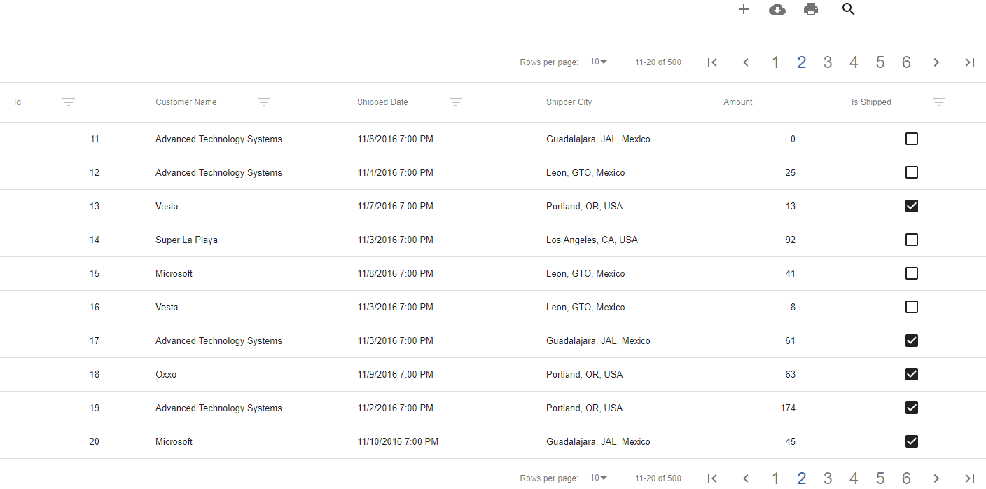
The preview of the previous code:
import  React  from  'react';
import  ReactDOM  from  'react-dom';

import { DataGrid } from  'tubular-react';

import { SpecializedColumns } from  './';

const  SampleGrid :  React.FunctionComponent = () => (
	<DataGrid
	gridName='SampleGrid'
	columns={SpecializedColumns}
	dataSource={'https://tubular.azurewebsites.net/api/orders/paged'}
	/>
);

ReactDOM.render(<SampleGrid  />, document.getElementById('root'));
The preview of the previous code:

Maybe you are wandering, what happend with the aggregation functions added in the Amount and CustomerName columns? see the Data Grid Response that correspond with the previous request:
{
	"Counter": 2,
	"Payload": [
		[
			1,
			"Oxxo",
			"2016-11-05T19:00:00",
			"Guadalajara, JAL, Mexico",
			95
		],
		[
			2,
			"Super La Playa",
			"2016-11-02T19:00:00",
			"Los Angeles, CA, USA",
			5,
		],
		[
			3,
			"Unosquare LLC",
			"2016-11-04T19:00:00",
			"Guadalajara, JAL, Mexico",
			36,
		],
		[
			4,
			"Microsoft",
			"2016-11-11T19:00:00",
			"Leon, GTO, Mexico",
			111,
		],
		[
			5,
			"Unosquare LLC",
			"2016-11-07T19:00:00",
			"Guadalajara, JAL, Mexico",
			42,
		],
		[
			6,
			"Microsoft",
			"2016-11-08T19:00:00",
			"Leon, GTO, Mexico",
			6,
		],
		[
			7,
			"Advanced Technology Systems",
			"2016-11-08T19:00:00",
			"Guadalajara, JAL, Mexico",
			97,
		],
		[
			8,
			"Super La Playa",
			"2016-11-06T19:00:00",
			"Portland, OR, USA",
			1,
		],
		[
			9,
			"Microsoft",
			"2016-11-09T19:00:00",
			"Portland, OR, USA",
			68
		],
		[
			10,
			"Microsoft",
			"2016-11-09T19:00:00",
			"Guadalajara, JAL, Mexico",
			16,
		]
	],
	"TotalRecordCount": 500,
	"FilteredRecordCount": 500,
	"TotalPages": 50,
	"CurrentPage": 1,
	"AggregationPayload": { // Here they are
	"CustomerName": 500,
	"Amount": 28007
	}
}
As you can see here they are
"AggregationPayload": { // Here they are
"CustomerName": 500,
"Amount": 28007
}
Why they didn’t appear in the Data Grid? . . .
DataGrid Props
Until now we haven’t been using DataGrid full features, as you can see in tubular-react documentation you can configure all the elements into the DataGrid components from the header, the paginator, the toolbar, the search text, the footer, etc. … In this ocasion, we will show our aggregation functions result on the footer.
import  React  from  'react';
import  TableCell  from  '@material-ui/core/TableCell';
import  TableRow  from  '@material-ui/core/TableRow';

import  {  DataGrid  }  from  'tubular-react';
import { SpecializedColumns } from  './';

const  SampleGrid  =  ()  =>  {
	const  footerRenderer  =  (aggregates:  any)  =>  {
		return  (
			<React.Fragment>
			{aggregates &&
				Object.keys(aggregates).map(aggregate => (
						<TableRow>
						<TableCell>Total {aggregate}: </TableCell>
						<TableCell>{aggregates[aggregate]}</TableCell>
						<TableCell  />
						<TableCell  />
						<TableCell  />
						<TableCell  />
						</TableRow>
						))
			}
			</React.Fragment>
	);
	};


return  (
	<DataGrid
	gridName='SampleGrid'
	columns={SpecializedColumns}
	dataSource={'https://tubular.azurewebsites.net/api/orders/paged'}
	footerRenderer={footerRenderer}
	/>
);
};


export  default  SampleGrid;
You can see a live example here: